This page is part of archived documentation for openHAB 3.2. Go to the current stable version
# User Interface Design Overview
Following the previous sections, you should have a working installation, with several Things, Items and Rules. You also ideally built a model to represent your home, and can succesfully operate your items individually within the administration area. You may now want to present them a little more nicely, to yourself or your family members, so they can interact with them or check their status easily without requiring access to these administration screens.
To do that, openHAB puts different options at your disposal; they are commonly referred to as Pages.
# Types of Pages
Several types of pages are available:
# The Home Page
The main's UI home page consists of 4 tabs:
- an overview which you can customize entirely from scratch;
- 3 tabs representing a generated view of your model oriented by Location, Equipment and Properties.
In these 3 model-oriented tabs, expandable cards will appear automatically as you build your model, allowing you to get different perspectives on your home. For instance, you may want to see everything in a particular location, or everything pertaining to a certain class of equipment, like heating, or see a consolidated view of all items related to a certain property like temperature or humidity. Clicking on the card will make it expand and reveal its contents. Some of these cards will also feature glance badges that will extract some predefined information from your model and display it without you having to open the card.
# Sitemaps
Sitemaps are hierarchies of pages and sub-pages that are comprised of simple controls from a well-defined, limited set. They have existed in openHAB since its first versions, therefore you will probably encounter a lot of examples referring to them throughout the documentation and in the older community discussions.
As they have less customization options than the other types of pages, notably as compared to the more powerful layout pages, they are also arguably easier to learn. You can define them either in configuration files, with a special textual syntax, or in the Pages section of the administration area; however, be aware that the main web UI is not currently able to display them.
Fortunately, there are however several other mature apps, notably the mobile apps for Android and iOS devices, but also Basic UI for the web, which are primarily dedicated to rendering sitemaps.
# Layout Pages
Layout pages, introduced in openHAB 3, are the most common and versatile way of displaying information in the main UI. They have extensive options to control how they are laid out, and can display Widgets coming from the built-in libraries or widgets that you have designed or imported in your personal library.
# Maps & Floorplans
Maps and Floorplans are Pages dedicated to displaying markers and other elements on a background overlay.
In case of floorplans, the background will be a custom image defined by you; in case of maps, it will be a zoomable view of the world from a provider service, either an actual map layer or a satellite view, centered on the markers that you defined.
# Charts
Chart pages are meant for interactive visualization of persisted data in the main UI. Options include displaying time series, aggregates, heatmaps, calendars, with the ability to select the period and date to show.
You can either start them from scratch by creating a new Chart page from the Pages section, or, when in the Analyzer, you can save the result of a analyzing session to a chart page for further customization and retaining the current view.
# Tabbed Pages
Tabbed Pages are Pages used to combine several other Pages and render them in tabs.
You simply configure the Pages that you wish to show, choose a few details about the tabs themselves (label, icon...) and can then consider the result as a single Page.
# Summary
The table below summarizes the different types of Pages and their compatibility:
| Type | Designed in | Viewed in | Stored in |
|---|---|---|---|
| Home | main UI | main UI | JSON DB |
| Sitemap | main UI or .sitemap file | Basic UI, iOS/Android apps and others | Configuration folder or JSON DB |
| Layout | main UI | main UI | JSON DB |
| Map | main UI | main UI | JSON DB |
| Floorplan | main UI | main UI | JSON DB |
| Chart | main UI | main UI | JSON DB |
| Tabbed | main UI | main UI | JSON DB |
# Designing Pages
You can see the list of your Pages in the administration area of the main UI under Settings > Pages, and from there, create new ones, as well as modify or remove existing ones.
ATTENTION
Sitemaps that you created in configuration files (sitemaps/*.sitemap files) are not displayed in this list.
Every type of Page has its own designer but all of them with feature a Design tab and a Code tab.
In the Design tab, you have a view of the Page that easily allows you to add Widgets in various parts. Every designer also has a "general settings" table that will allow you to specify the identifier, the label, as well as some common settings.
You will often find black buttons denoting that the component beside or beneath it can be customized. Some will open menus, that allow to open the configuration sheet for this particular component, reorder them, copy or paste them, remove them, or bring up the part of the YAML structure describing it and its descendents.
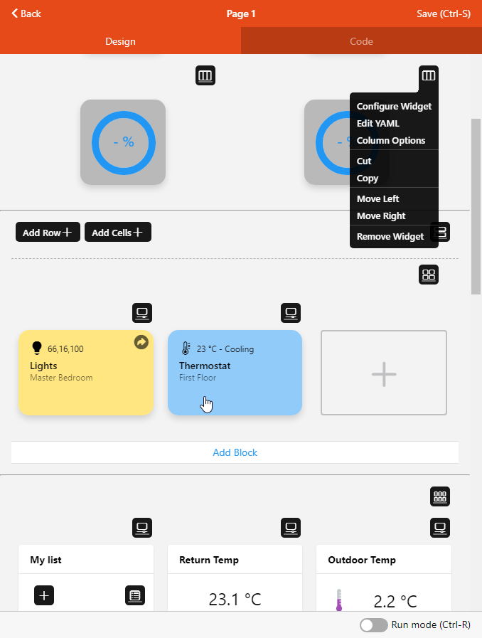
In the Code tab, you will be able to alter the component structure of the page, either with the sitemap syntax, or with YAML. In case of YAML, you can trigger autocompletion in many places of the YAML code:
- at the root or component level, hit Ctrl+Space to start a
configsection, aslotssection, or aslotssection with adefaultslot; - at the
configlevel, hit Ctrl+Space before the property name to display a list of properties and add one of them; - at the start of a property's value in
config, hit Ctrl+Space to display a list of options if the property has some (including items).
Some of the designers will also have a Run mode that you can activate with the switch on the bottom toolbar if present, or the Ctrl+R keyboard shortcut. It will allow you to preview the page as it would be rendered (some actions will still not work in Run mode).
# Organizing & Displaying Pages
Whereas in sitemaps, the entirety of the hierarchy is constrained within the sitemap definition, other types of pages are standalone, but can link to each other.
You can indeed navigate from one page to the next, either with standard full-screen replacement, or in a modal window: you do that by configuring appropriate actions on some of the source page widgets, referencing the next. For instance, clicking on a marker on a Floor plan page can open a popup, displaying a Tabbed page itself containing a Chart page, a Layout page and a Map page.
By carefully designing the navigation & interaction between pages, you can make up a coherent and complex user interface system. You have two entry points to this system at your disposal:
- the Overview page;
- Pages that you promote to the main UI's Sidebar.
# The Overview Page
A Layout Page named Overview (id: overview) is automatically created when you start.
The contents of this page will be shown on the Overview tab of the home page (see above): this page will be displayed when you open the main UI with the default URL.
As a result, it's arguably the most important of them all, because that's what yourself, your household members and your eventual guests will see first, possibly on their narrow mobile screens.
You should therefore make good use of this page and carefully design it to be as straightforward as possible, and restrict it to the most important controls only instead of cramming it with information that might not be always useful or relevant; common examples include scenes for the entire home, buttons to indicate presence, various alerts, or dynamically displayed information based on context. You can also use it as the starting point of a more elaborate menu system made of other Pages.
You will likely notice, the more you use the user interface, that when you use it at all, you always come back to the same controls: that's because you (hopefully) made comprehensive automation rules to make sure all you need to get to the state that you want is triggering those rules - and this can be done with a mere button. Those are the critical controls that you should focus on when designing your home page.
Of course, you will also probably need to dive into details from time to time, but everything doesn't have to fit on this overview page, so you can also create more of them that will be displayed upon clicking on a button.
# The Sidebar
Another entry point to start navigating your Pages is to put some of them on the main UI's Sidebar: they will appear on the left side, or in the left drawer on smaller screens, just below the openHAB logo.
To put a page on the Sidebar, open the Sidebar & Visibility option in a Page's general settings, and enable the Show on Sidebar toggle.
Sidebar order allows to reorder the sidebar menu, choose an integer for each page on the sidebar, the lower values will make the page higher in the menu.
# Additional Properties
You can put additional properties on a page's root component config which will influence its display.
# Visibility Restriction
The visibleTo property allows you to control whether the page will be viewable based on the current user's role.
The built-in roles user and administrator will be configurable in the Design tab, but you can also use YAML, in which case an array of role:(role) and/or user:(userid) strings is to be specified.
WARNING
Do not be fooled into assuming the “visible only to” feature gives you any security, it’s only a way to restrict the visibility; it can be enough for non tech-savvy users but there are many ways to circumvent this restriction and talk to your items anyways.
# Additional Styling
The pageStyle and modalStyle properties can be used on a Page component itself to set additional CSS properties to the parent responsible for displaying the page, normally not accessible.
The styling will be applied to the f7-page component (in the former case, for pages displayed full screen, in the latter case, for pages displayed in a modal like a popup window).
These properties are useful for instance to configure the background, or alter some CSS properties for the entire page.